
Home » Graduation
Category Archives: Graduation
Graduation Card to celebrate Joshua
Congratulations to our grandson, Joshua Decker, on his High School Graduation!


 .
.
 .
.  .
.  .
.  .
. We are so proud of Joshua!
For his card, I used the colors on the graduation announcement to make the front of the card. There was just a touch of green on the Eaton Eagle so I bordered the circle with a little green. The banner is silver but to get the stamped images on the sides to show in the picture I had to turn it a bit sideways and the banner looks gold!
Recipe for Joshua’s graduation card:
The card uses several stamp sets:
- Clearly Whimsy Stamps Collection – Graduation- DA1173
- You Did It on the circle
- Diploma on the left
- Inside (one stamp)
- Vertical Greetings for Congrats on right side
- Reflected In Nature for the Eagle on the top left
- Day By Day Numbers for the 2023 on the bottom right
- Make A Difference for Joshua’s name
Heather taught us how to use the Tailored Tag Punch to make the graduation cap (mortarboard cap) by punching once and then hold the punched image with a sticky note and punch a second time. Punch just the side of the punch for the base of the cap.
The circles are made with dies from the retired circle set with the 5th largest die in Granny Apple Green and the 4th largest die in Basic White embossed with the confetti embossing folder.
The Banner Die is the 5th in the retired banner die set.
- Base: Thick Basic White, 5 1/2 X 8 1/2, scored at 4 1/4
- Layer 1 (X2): Night of Navy, 4 X 5 1/4
- Banner: Silver Foil, 2 1/2 X 4 1/4 die cut then embossed with the Star embossing folder
- Granny Apple Green: Die cut for a border with 5th largest circle
- Basic White: 3 3/4 X 5, die cut with 4th largest circle and emboss with confetti embossing folder
- Cap: Black Foil, 2 X 3, cut with Tailored Tag Punch
- Inside Layer: Basic White, 3 3/4 X 5, stamp and color
- Embellishments: Navy Twine made into a tassel secured with a black brad, 3 Swarovski crystals
 Did you use Copic markers to color the inside?
Yes, Sal, but I failed to write down which colors I used. Next time.
The design inspiration comes from the card Heather Guitreau made at our shoebox event:
 .
.  .
.
Lovely cards, Heather!
Thank you for stopping by my blog for…
A pinch of creativity to spice up your crafting world!
Karen
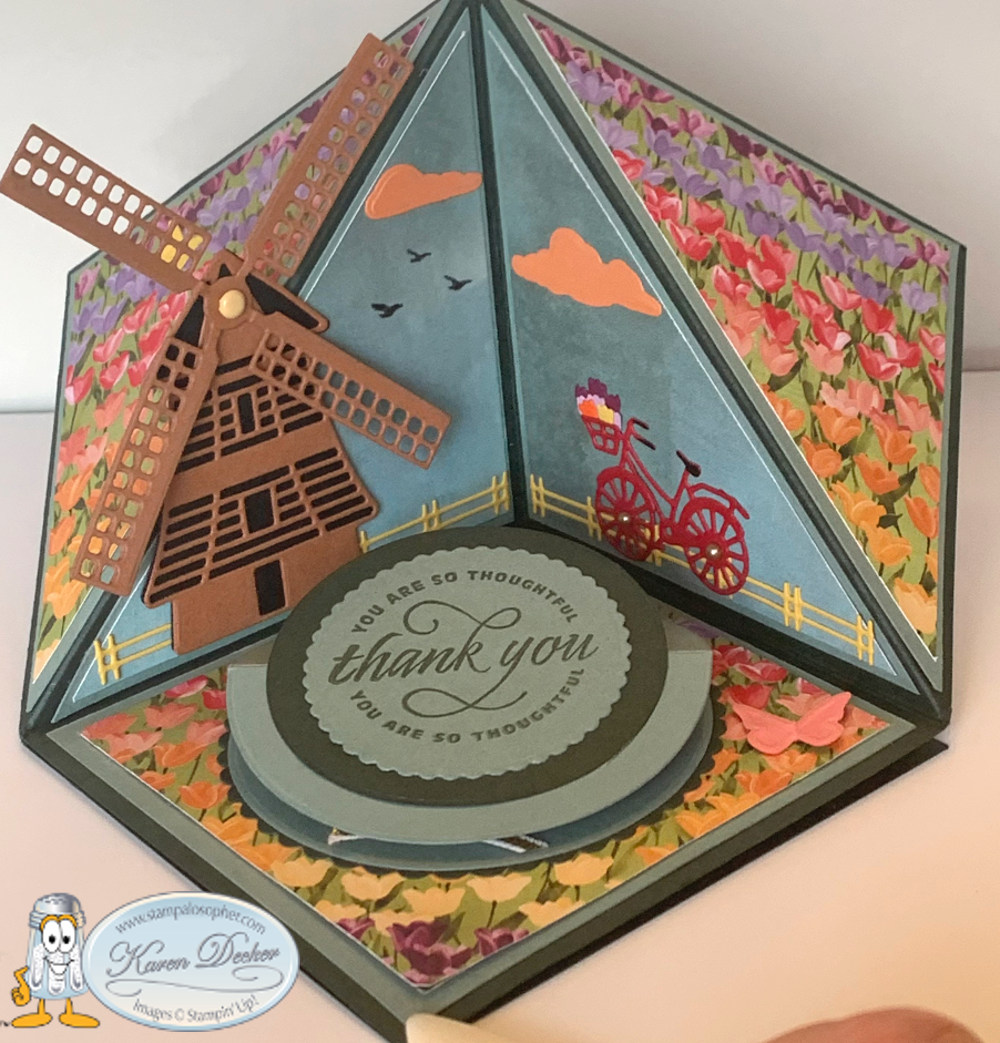
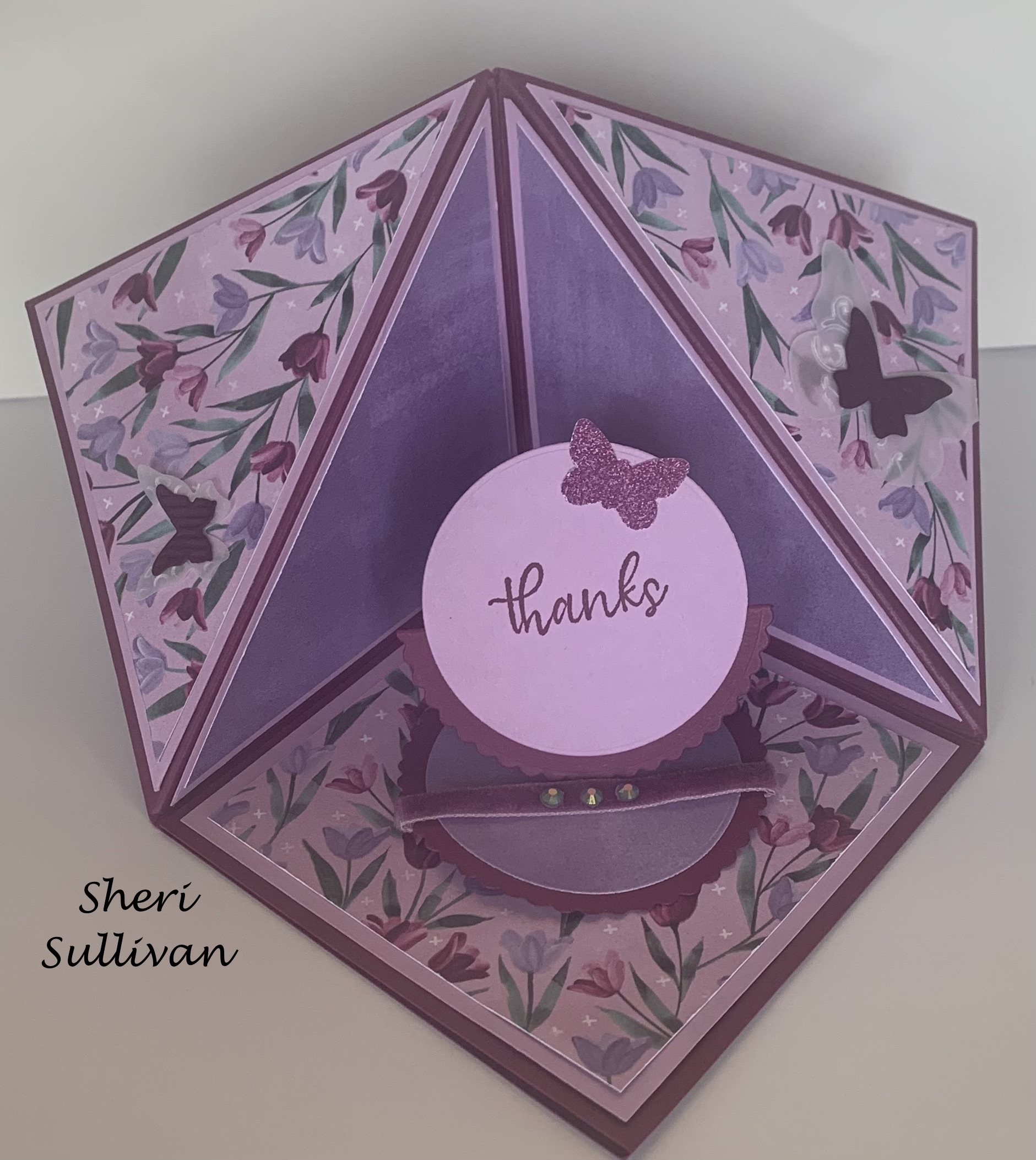
Triangle Corner Pop Up Card for Case The Creator (CTC) #3
Hello Stamping Friends,
Case The Creator Card Challenge
This month we cased Dawn Griffith’s Triangle Corner Pop Up Easel Card!
Yes, Dawn calls it a “Fancy, Schmancy Corner Fun Fold”! Her video is in the instructions.
Case The Creator #3 printable pdf file

I ordered the tiny magnets from Amazon:

 .
.  .
. 
The bicycle is hidden when you open up the easel so be careful with your design. I had a lot of fun with the bicycle! I used the long, tiny tulip die to create a basket of tulips! I will write my greeting under the ‘thank you’ since I went against protocol and made the bottom left another flower display instead of the place to write a note.
Heather made a fabulous graduation card with beautiful gold embossed paper and black! I love the diploma for the easel stand up!
 .
. 
Joy’s beautiful card uses the ‘Expressions In Ink’ designer series paper. We only have until May 2nd to get discontinuing items, like this DSP, from the annual catalog!
 .
.
Sharon’s uses the Tea Time stamp set and Tea Together dies- look at the little heart she put on the lid!

Sheri used the ‘Flowering Fields’ DSP and the ‘Simply Succulents’ stamp set for greetings:
. 
 .
.
Ann used the ‘You’re A Peach’ DSP and the ’Sweet As A Peach Bundle’. Those peaches even look fuzzy! The amazing “Dist ink tive” stamps! These are in the Annual catalog as well so order before May 2.

 .
.
Jo’s little rabbit made us all smile, and eggs from the Arrange A Wreath set and Wreath Builder Dies were perfect with the paper.
 .
.  .
.
 They followed instructions and had a large place for a message.
Indeed! Isn’t it fun to see all the different creations from one set of instructions?!
SAL, Seeing April Leave
Karen
Click on little Sal in the computer to shop.

Peek A Boo Card and Open Book Easel Card
Hello Stamping Friends,
Let’s look at this month’s club cards for those who have kits and need the instructions or those who want to recreate cards like them!
Peek A Boo Card

Here is the Youtube video: (Did you know you can go to the settings and increase the speed?)

Thanks to Dawn Griffith for these dimensions.
- Base: Basic White, 4 1/4 X 8 1/2 scored at 4 1/4
- Using the 2nd Largest Oval in the Stitched Shapes Framelits, fold the Basic White and cut ovals on the right hand side through both front and back. My ovals are 1/2″ down from the top to the top edge of the framelit, 3/4″ up from the bottom to the bottom edge of framelit and 2 1/4″ from the right side of the Basic White to the left hand side of the framelit.
- Front: Hydrangea Hill Designer Series Paper (DSP), 4 1/4 X 5 1/2
- Inside: Hydrangea Hill DSP, 4 1/4 X 4 1/4 (minus a hair on the horizontal side to take into account the score line)
- Using your Oval Framelit and a sticky note to hold the DSP in place on the Basic White, cut an oval in the front DSP and another oval on the inside DSP. SAVE the cutout from the inside to glue on the mechanism.
- Mechanism A: Highland Heather, 4 1/4 X 5 3/4, scored on the long side at 5 1/2
- Mechanism B: Highland Heather, 4 1/4 X 3, scored on the short side at 2 3/4
- Fold and burnish well the 1/2″ tabs on mechanisms A & B. Attach A to the left side of the front DSP with the tab to the inside and attach B to the inside DSP on the right hand side with the tab hidden on the inside. Note: I used tear and tape and rolled the tiny bit of excess tape back onto itself to prevent any glue from catching on the mechanism.
- Use a pencil to outline the oval on the Highland Heather and stamp your front greeting. I used Blackberry Bliss to give a darker purple color and the friendship greeting in ‘Grace’s Garden’ stamp set.
- Stamp the greeting on the oval cutout for the inside; I used the friend greeting from ‘Heartfelt’
- After attaching the mechanisms, glue your inside DSP to the Basic White and then the front DSP to the Basic White. Note: put the glue on the white not the front DSP because that piece is larger than the Basic White. The small mechanism should go into the middle with the large mechanism at the back.
- Use your pencil again to draw the oval for the inside on the mechanism that peeks in when you open the card. Glue the oval cut out in place
- Embellish with a little piece of ‘Gorgeous Grape Ribbon’ 2 X 1 1/2, two blackberry bliss punched butterflies, 3 pastel pearls and 1 butterfly gem (can you find it hiding on the left hand side?)
Open Book Easel Card
I was so delighted with how this card turned out and patting myself on the back but then had a humbling experience as I tried to do the Facebook Live and the sound echoed and the lighting didn’t work…… The silver lining to the mishaps was that I went to Youtube and learned how to edit a Youtube video so I could cut out the first eight minutes of echoing to make it a little easier for you to endure. Unfortunately, I couldn’t fix the lighting so it still has a bit of a glare – so sorry for that less than professional presentation. If you viewed the first video you see I had both lighting and sound corrected. I made better notes for set up next time.


Thank you to Tina Zinck of the Serene Stamper for teaching me how to make an Open Book Easel Card.
- Base: Misty Moonlight, 5 1/2 X 8 1/2 scored at 2 1/8 and 4 1/4. Fold in half and then Z fold the 2 1/8″ score line
- Bottom Layer at top of easel and the layer at the base of easel (X2): Brass Foil in the ‘World of Good’ DSP, 5 1/8 X 1 7/8, watch the direction of the words as you glue the pieces to the base
- Easel Stand: Misty Moonlight, 5 1/8 X 7/8 and a DSP strip of compasses, 4 7/8 X 5/8; Note the Misty Moonlight has no border but the compasses DSP does have a border
- Globe and Stand: Misty Moonlight, 2 1/4 X 2 1/4, Die cut circle with the circle in the World Map Dies, Use Brass Foil 2 1/4 X 3 1/4 to die cut the globe and the stand
- Book Layers:
- Cinnamon Cider: 5 1/8 X 3 7/8; score at 2 9/16 – one 16th mark past the half mark
- Designer Series Paper: (Beige with words) 4 7/8 X 3 5/8; score at 2 7/16, one 16th mark less than the half mark
- Cinnamon Cider: 4 5/8 X 3 3/8; score at 2 5/16, one 16th mark past the quarter mark
- Designer Series Paper: (Map) 4 3/8 X 3 1/8; score at 2 3/16, one 16th mark less than the quarter mark
- Banner: Cinnamon Cider, 1 X 3, Stamp with Memento Black and embellish with the Antiqued Corners
Curl each of your book layers. Break the fibers with the bone folder then wrap around the Take A Pick tool.
Place Tear and Tape on the middle of each book layer, burnish well, attach to its layer. Note: fold the layer in half to place so you can get it right on the score line of the next layer down.
Place glue dots on the edge of each layer and push the layer in toward the middle to maintain the curl before you push down on the glue dots. Hint: Use less curl if you are mailing and a little more if you are hand delivering.
Place Tear and Tape on the easel top base at 1/16 down from top and over 1/16 on the right and the same on the left and all the way down on the top easel layer to mount the book to your easel base. Mount your book recurling that last layer if needed.
Use glue dots to mount the globe to the bottom of the top page of the book checking placement so that the globe fits correctly on the base.
Stamp your greeting on the Cinnamon Cider strip, embellish with the antique corners and mount with glue dots.
I used white embossing and “Congratulations on this new beginning” on the inside.
That, my friends, is the second of our two club cards for April. May is the catalog launch and then we start a new club rotation in June so contact me if you are interested and I will answer any questions you may have. Text 303-815-0838.
Remember: the World of Good Suite and all its individual products (page 24-26 of the Annual Catalog) are retiring and most have a huge discount right now so head to the online store to purchase them. The Butterfly punch I used on the first card is also retiring (Butterfly Duet, pg. 165) and it is great for quick embellishments in the color of your choice. Butterflies are always good for those times when we get a shadow or smudge on our artwork!
Have a wonderful day!
SAL, Share A Love of stamping

Music From The Heart
Today I am sharing three cards with several of my favorites:
First Card with my favorite- Music From The Heart:

Dawn Olchefske achieved one million dollars in sales and designed this stamp set as one of her many rewards!
 When you reach one million will you design a set with me?
Of course if Toons4Biz will allow it.


This is Whisper White with a white background and natural light just like I researched would be best for picture taking and now I have a bluish white instead of yellow.
Better go back to the Youtube videos on that one.
Sigh….
The hearts have Wink of Stella to add some sparkle. I felt like Cinderella with the birds making the bow.
Recipe:
Base: Basic Black 5 1/2 X 8 1/2 Scored at 4 1/4
Top: Make 2 – 5 7/16 X 4 3/16 I know, crazy, but I wanted just a little black. Go to the 5 1/2 mark and move back 1/16 to get 5 7/16. For 4 3/16, go to 4 1/4 and move back 1/16. That is easier than counting 16ths.
Piano: Whisper White 2 1/8 X 2 3/4
Two Keyboard Pieces to layer at the bottom: 3 X 2 1/4, stamp twice and fussy cut. Adhere to bottom and then fussy cut around the bottom inside and out.
6 ” of twine
To cut your white top piece:
- place a pencil mark from the top right corner over 3/4″ and from the corner down 2 1/4″
- place two pencil marks from the bottom left corner up 1/4″ and up 1/2″
- cut diagonally from the 1/4″ mark at the bottom to the 2 1/4″ mark at the top right
- cut diagonally from the 1/2″ mark at the bottom to the 3/4″ mark at the top right
- shave off 1/16″ on each side of the middle piece
Okay, let me grab the sketch book.

Once they are cut remember to cut off just 1/16″ from each side of the middle piece so you have the black showing.
Second Card with two Favorites: Beautiful You and Special Celebrations:

I have used a stamp from this set on so many different cards. Today I used it on a graduation card that I am casing from Sharon Armstrong.


The Congratulations is from the retiring Special Celebrations set:

Recipe:
Base: Gorgeous Grape 8 1/2 X 5 1/2 Scored at 4 1/4
Layer 1: Smoky Slate 3 3/8 X 4 5/8
Layer 2: Gorgeous Grape 3 1/4 X 4 1/2
Top Layer Outside and Inside: Whisper White 3 X 4 1/4 – make 2
Inside Layer: Smoky Slate 3 3/8 X 4 5/8
Cap: Gorgeous Grape 1/2″ square
Diploma: Copy Paper 1/2″ X 5/8″ rolled up and tied with a double wrap of 2″ of colored twine
Tassle: 8″ colored with the Highland Heather Stampin’ Blend
- wrap twine 4 times around 1″ of cardstock
- cut the bottom ends and remove from cardstock
- slip the top ends on the end of your Take Your Pick tool
- tie another short piece of twine twice around 1/4″ from the top
- Use a glue dot to adhere the top to the middle of the cap
- punch a 1/16″ circle from Gorgeous Grape and put on top of the tassle
I used the Highland Heather Stampin’ Blend to color the dress and create sleeves then used a black journaler pen to color the edges of the sleeves. Ivory Stampin’ Blend was used for the legs and arms and Smoky Slate for the shadow. Wink of Stella was used to color the slip.
‘Congratulations’ was stamped in Versa Mark and then sprinkled with Silver Embossing Powder and heat set. The inside greeting is a retired Stampin’ Up! stamp.
Third Card with Two Favorite Retiring Items – Flourishing Phrases and the Pretty Label punch:

The Flourishing Phrases greeting set and the Special Celebrations set are excellent additions to your collection and you will use them over and over. I used Flourishing Phrases for a sympathy card in a Mystery Card Challenge. That is a challenge where you are given a specific list of supplies and measurements and you create a card with just those supplies.


Recipe:
- 1/2 sheet cardstock
- Designer Series Paper 3 X 5.5
- Coordinating Card Stock 3.25 X 5.5
- Stamp Set with words
- Punched Shape
- Ribbon
- Matching Ink
- Adhesive
I know, Sal, it was a fun challenge but I found out none of us avid crafters can make a card without blinging it up. I even had to add a few jewels.
Here is a card I made for my upline’s Mystery Card challenge that meets most of the criteria. I did use two ink pads, though.

SAL, Sharing A Love of stamping
Karen

Vibrant Vases Tri-fold card
Good morning, Stamping Friends,
It probably won’t be morning by the time you get this post in your mailbox but currently it is still morning in Karen’s World!

Don’t you mean Stampalosopher? Karen’s World was your accounting firm.
Yes, indeed, it is a Stampalosopher World! Today I have one of two cards to show you that I created for a stint as a guest presenter in Grand Junction. The first was inspired by Joy Meadows and the very lovely card she sent for my birthday. Thank you, Joy!


Do you see how the front right hand flap is exactly the same size as the left side white layer with the same size black border? So cool! The white flaps inside and out are 3″ X 3 1/2″ with a black border of 3 1/8″ X 3 5/8″. The paper is from the SAB (Sale A Bration) Botanical Butterfly DSP (Designer Series Paper). One side had butterflies and the other had black and white designs like the dots Joy used here. I hope you stocked up on this paper during SAB! Her base is 9 7/8″ X 5 1/2″ scored at 4 1/8″ and 8 3/8″ . This leaves a right hand flap of 1 1/2″. The butterfly is from the Butterfly Gala stamp set which is still current and has a punch to match. See page 46 of the Annual Catalog.

But Karen, you can’t use retired Designer Series Paper!
I know, Sal, so I chose to use the Vibrant Vases and the Pressed Petals DSP with an accent color of Blueberry Bushel, one of the 2018-2020 In Colors that I will definitely need to stock up on before it retires next June.
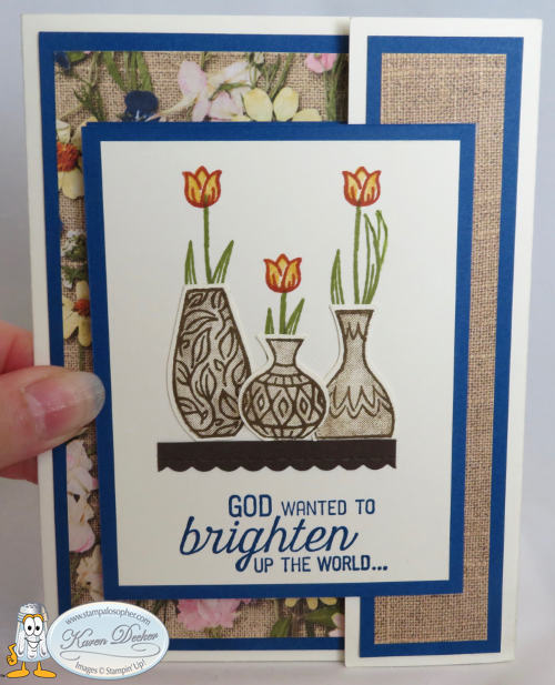


Don’t you love the Pressed Petals DSP with the Blueberry Bushel? There is even a sheet of the DSP with plain burlap that I used for the right side little panel to coordinate with the background of the pressed petals.

And the Pressed Petals is part of the current “Buy 3 packs of DSP and Get One Free”!
That’s right, Sal, thanks for the input!
I used the Flourishing Phrases stamp set for the sentiments on the flap and the left side of the card and left the inside blank for a birthday, congratulations or just thinking of you sentiment. I needed a little larger flap than what Joy used for the butterflies so the measurements won’t be the same. The goal was to have the outside vases a bit plain with the inside vase truly “vibrant” to match the sentiments. The Vibrant Vases stamp set is a two-step stamp set with outline stamps for the vases and then a stamp-to-color for each vase and it even has a punch to match! Check out page 61 of the Annual Catalog. The yellowed images show what images are punchable. (Is that a word?)

I stamped the outside vases with the border stamps in Soft Suede and then stamped again with the stamp-to-color stamps after stamping off to lighten the image. I used the “H” acrylic block and spaced out the three vases and stamped with the outline stamps on a 6 X 3 piece of Whisper White. I then placed the (clean) stamp-to-color stamps on top of the images and took another “H” acrylic block and pressed it down on the stamps to attach them to the blocks in the perfect position. The stamparatus would have worked better but it was in use for the other card.

You could order a second one. I could help, page 184, #146276.
Thanks Sal. That might be a good idea for the next time. To make the inside vase truly “vibrant”, I stamped it in Blueberry Bushel, colored in the diamonds with Cajun Craze and Daffodil Delight regular markers and then took my Versa Mark ink and inked the entire image. I applied “Clear Embossing Powder” and then heated it to make the vase look like glass.
Stamp the greenery and flowers directly on the Very Vanilla card stock pieces – the flap for the outside and the Pretty Label punched piece for the left hand side. Adhere the vases directly to the paper since they are punched out and look 3D without dimensionals. I adhered the two larger vases close enough together so that I could adhere the middle little vase slightly on top of the larger ones and all three would fit on the 2″ shelf that was cut from Early Espresso card stock to a final size of 2″ X 1/4″ with the “Be Mine” stitched framelits. Hint: Start with a larger piece of Early Espresso and cut the scallop edge with the framelit and then place it in the Stampin’ Trimmer to cut to the 1/4″ shelf size. I cut a piece longer than the desired 2″ so I could cut exactly 1/2 of a scallop at each edge of the shelf.
She told me she was a “recovering perfectionist”! Maybe she needs more therapy. SHHHH……
Did you say something, Sal?
The shelf is adhered with the top of the shelf 1 1/4″ from the bottom of the Very Vanilla layer and 3/8″ over from the left and right sides. Stamp the greeting in Blueberry Bushel under the shelf.
It can be tricky to stamp the greenery at the right spot for the vases so stamp your vases and punch them out then trim off the bottom white edge of the vases. Punches generally leave a little edge all the way around the image just like what we teach in fussing cutting. You want the vases to sit directly on the shelf so trim off that bottom edge.
Temporarily place your vases where you want them on the shelf and use a pencil to lightly outline the top of each vase. Now make three more light pencil marks where you want your stem to attach to the tulip. The tulip is 3/8″. Vary the heights of the three tulips. Use a sticky note to mask the shelf and where the vases will be and stamp the stem and greenery in Old Olive. Then stamp the tulips in Cajun Craze and stamp-to-color in Daffodil Delight. I had a shadow on one of my leaves so I just hand drew another leaf to utilize the shadow.
Sheri always called that “Design Opportunity”!
That she did! And that it is! We sometimes use tiny butterflies or hearts to cover our shadows and it adds beauty to the card. I just ordered erasers from Amazon that are supposed to remove ink without damaging the paper. I will let you know if they work.
A Stitched Labels Die is used for the little greeting that says “so he made you” and the fancy die in that same set is used for the DSP cutout on the left side. The Pretty Label punch is used for the vase and flowers on the left side. This is one of those times when you want to punch first and then stamp so you can align the flowers and vase on the punched piece. Use the same procedure of placing the vase temporarily on the piece, lightly draw the top of the vase, mask with a sticky note and stamp the flowers with Memento Black ink, then adhere the vase, color the flowers in Daffodil Delight and the greenery in Garden Green. Adhere rhinestones colored with Cajun Craze Stampin’ Blends. Sponge the edge of the Pretty Label punched piece and the little rectangle greeting with Blueberry Bushel and pop up both pieces with dimensionals.
Summary:
Stamp sets: Vibrant Vases, Flourishing Phrases
Inks: Blueberry Bushel, Soft Suede, Old Olive, Cajun Craze, Daffodil Delight, Tuxedo Memento Black
Markers: Blueberry Bushel, Garden Green, Daffodil Delight
Stampin’ Blends: Cajun Craze to color rhinestones
Framelits/Dies: Be Mine, Stitched Labels
Punches: Vases Builder, Pretty Label
Embellishments: Four rhinestones colored with Cajun Craze
Card Base: Thick Very Vanilla 9 7/8″ X 5 1/2″ Scored at 4 1/8″ and 8 5/16″ ; Fold in the little right side first and then fold in the left side over the middle.
First Layer on left side and middle: Blueberry Bushel (make 2) 3 7/8″ X 5 1/4″ , Cut out the middle of the inside one. I used a retired rectangular framelit that I use to save paper when I am layering. A stitched rectangle framelit would work as well.
Second Layer on left side and middle: Pressed Petals DSP (make 2) 3 5/8″ X 5″ ; Cut out the center of the inside DSP layer with the Stitched Shapes Die- the fancy one. Use the cut out for the left side behind the Pretty Label punched piece.
Third Layer on left side and the flap for the front: Blueberry Bushel (make 2) 3 1/8″ X 4″. The left side 3rd layer is adhered 1/2″ down from the edge of the DSP and 1/4″ over from the edge of the DSP.
Fourth Layer on left side and the front flap: Very Vanilla (make 2) 2 7/8″ X 3 3/4″
Little Right side first layer: Blueberry Bushel, 1 1/4″ X 5 1/4″.
Little Right side second layer: DSP in plain burlap 1″ X 5″
The Blueberry Bushel Front Flap is adhered 1/2″ down from the burlap DSP on the little right side to exactly match the left side. This is done last! I put two pieces of tear and tape at the far right of the flap and then matched up the flap to the card’s left side and pressed it in place.
Shelf: Early Espresso, 4″ X 4″ Cut to 2″ X 1/4″ with the Be Mine Scalloped framelit and the Stampin’ Trimmer
Vases: Very Vanilla, Use the leftover from cutting the base or a 6″ X 3″
Punched Label: Very Vanilla 2″ X 2 3/4″
Left side greeting and the left side vase: 1 1/2″ X 3 3/4″ , you need it large enough to be able to hold it as you punch the vase. Stamp the greeting on the same piece and cut with the Little Stitched Labels Framelit.
I remember you looking at that little Die and saying it was too little to use for anything.
I did say that! Amazing isn’t it?! I am glad I have that set. I used two of the Dies on this card. I love the one I call the “fancy” Stitched Label Die!


Okay Sal, I am through with this post and it is your turn to guide folks to the store where they can shop to their hearts content! Don’t forget to check the Clearance Rack, friends, before you place your order, there are many Christmas sets available at great prices. I have a post coming up from our first Christmas card Stamp-A-Stack called Clearance Rack meets Stamp-A-Stack. Stay tuned!
SAL, Stamp A Lot, Smile A Little, Share A Love
Karen


Tranquil Tulips


Hello Stamping Friends,
Spring has been gorgeous in Castle Rock this year! Usually our lilac buds get frozen with a spring cold front and we miss out on the beautiful blossoms. Not this year! They are fabulous and I didn’t even have to run out and cover the bushes with a sheet. We have several little yellow finch friends to entertain us as well. One flower I have never had much luck with is the tulip. The green stem will pop out of the ground but seldom produce a flower. So let’s make a paper tulip card!

These tulips have amazing art work built in to the stamps- white stripes on the blossoms, leaves with shades of green and a stamp for the middle.

I suppose with three grandsons I will get used to bugs in a jar but I would rather fill a jar with strawberries or flowers! I cased the layout of the tulips from someone on pinterest but made the bottom a flower box and added the ladybug and butterfly. I stamped the three butterflies on vellum and then rubbed the back of the circles on the butterfly’s wings with my stylus on the foam pad to make them bright white, then colored the back with my Daffodil Delight Stampin’ Blends marker. I was making six of these cards so I folded the wings of the two larger butterflies for a 3D effect like this:

I used many retiring items that you can still purchase for the next five days. The base of the card is Elegant Eggplant with a Rose Red layer. The tulips are Elegant Eggplant, Rose Red, and Perfect Plum with Wild Wasabi for leaves – all are retiring colors.


The label I used to create the stand for the Easel card is from the Label Me Pretty stamp set. 

The “Thank You” comes from another retiring set “Swan Lake” .
 Check out that cute little dragonfly! This set has so much potential and makes me feel peaceful just looking at the images. Another of the ‘Label Me Pretty’ images:

The “Love You” is from the ‘Banners for You’ stamp set….. I put a sticky note over the ‘I’ in the greeting, inked, removed the sticky and stamped. I liked the little dots on the stamp set but used a marker to make them bigger and added a few extra dots of my own. For both these greetings I punched a 1 3/4″ circle from the Wood Textures Designer Series Paper to match the flower box. I popped up both the greeting and the circle to have a nice tall easel holder. I tried out the third stamp with all the flowers around the Happy Birthday. I first stamped and colored the image but it lost too much detail so I colored the back of my stamp with regular markers, huffed on the colored stamp, and then came up with an image with more detail that I popped up on an oval cut out in the wood:

Did you notice the Versa Mark images on the sides of the popped up greetings? I used the hearts from the Ronald McDonald set to stamp around the birthday greeting since it is going to my daughter. For the others I used tulip images from the ‘Lovely Wishes’ stamp set in the Occasions Catalog.
 I recently attended a Mile High Stamp Camp with amazing Stampin’ Up! demonstrators. I wish I remembered the name of the lady who designed this card using the ‘Lovely Wishes’ set:

I needed a sympathy card so I took her design and used the ‘Petitie Pairs’ stamp set from the past for a tiny greeting to fit between the flowers. I have the old Ovals set so I sponged the edge to get the same look as the ‘Layering Oval’ set used above.
 The layering ovals, squares and circles carry over in to the new catalog. I didn’t think I wanted the ‘Ruffled Embossing Folder’ used here until I actually used it in the stamp camp. It is unique and not just for shingles on a house like I imagined and it carrys over. Five embossing folders are retiring but the one that I will miss the most is the ‘Brick Wall’ embossing folder. Remember this card from the past?

Let’s not think fall, let’s think spring and graduation! I needed a graduation card so I used the retiring ‘Marquee Messages’ set and a graduation cap stamp from a previous Paper Pumpkin. There are fun confetti products in the “other” store that you could use for the graduation caps:

This set lends itself to so many different occasions:
 And if you need a unique gift box for that special graduate’s gift card, I suggest the Window Box Thinlits dies #142762 topped with a square piece of cardstock, 4″X4″ and a tassle made from our solid black baker’s twine and a 1/2″ punched black circle glued on a large brad. We have a ‘Mini Tassels Assortment’ you can purchase and then dip in a bowl of reinker to make just the right color. Yes, it is retiring as well.

You would need the longer ones for the box above but these would be cute on a card front with a punched cap.
I can’t leave today’s ultra-long post without sharing three other cards. In the last post I showed my favorite retiring stamp set in use on an Eclipse card. Here is another card we made at a past club meeting with the ‘Awesomely Artistic’ set, and the ‘Wild About Flowers’ set which has greetings that are so ideal for retirement or new beginnings.


This is the ‘Birthday Blossoms’ set . Scroll down in the Recipe Box to find these cards with instructions.
 ‘Birthday Blooms’ . This pull up card was fun to make at club. Go to the Recipe Box tab to be directed to the original post.
To make this Easel Card:
- Base – Elegant Eggplant – 4 1/4 X 11 scored at 5 1/2 and 2 3/4
- Layer 1 – Rose Red – 5 3/8 X 4 1/8 (make 2)
- Layer 2- Whisper White – 4 X 5 1/4
- Layer 3 – Wood Textures DSP – 1 3/4 X 4 with a strip 3/8 X 4 and a scrap to punch the 1 3/4 circle for behind the greeting
- Cut Outs- top of tulips, ladybug, and greeting – Whisper White 3 X 5 1/2
- Butterfly – Vellum 1 X 1
- Ribbon – 1/4″ stitched edge Rich Razzleberry, 6″ to wrap around the flower box and 8″ to tie a bow
- Inks – Elegant Eggplant, Rose Red, Perfect Plum, Wild Wasabi, Memento Black, Versa Mark
- Stamp Sets – Tranquil Tulips, Swan Lake, Label Me Pretty, Sharing Sweet Thoughts, Lovely Wishes, Banners for You
- Enamel Shapes
- Pretty Label Punch, 1 3/4″ circle punch
- Stampin’ Blends- Daffodil Delight, Cherry Cobbler; Wild Wasabi Marker (ladybugs feet background)
Thank you for your time.
SAL, Share A Love
Karen


Welcome to my blog!

Sal Window to Products


